

Table of Contents
- Why a candlestick is only half the story
- Meet the volume footprint
- Imbalances: the lane markers of intent
- The Absorption Initiation Pattern (AIP)
- Raise probability further with the Cumulative Volume Delta (CVD)
- Step-by-step trading framework (higher-timeframe, repeatable)
- Does this apply to crypto?
- Common pitfalls and how to avoid them
- Quick reference: what to look for
- Final notes
- FAQ
Why a candlestick is only half the story
A candlestick is the foundation of trading, but by itself it only shows an outcome: open, high, low, close. It does not show the battle that happened inside the candle — who was aggressive, who got absorbed, or where the true interest sat. Order flow gives you that missing layer. Imagine getting a sheet that lists every bid and ask placed during a candle. That is what order flow feels like in practice.
Meet the volume footprint
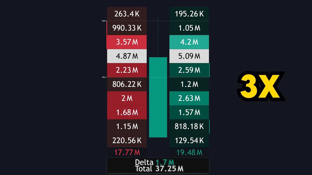
The volume footprint visualizes executed volume at each price inside a candle. It turns a single candlestick into a map of buying and selling activity.
Key elements to read:
- Left numbers = sell volume (aggressive sellers hitting bids).
- Right numbers = buy volume (aggressive buyers lifting asks).
- Value area = the zone between VAH (value area high) and VAL (value area low) where ~70% of the volume occurred for that candle.
- Delta = difference between buy and sell volume for the candle. Positive delta = buyers in control. Negative delta = sellers in control.
The footprint is color coded: darker colors for low-volume price levels, lighter or white for high-volume levels. Those white price cells often act as short-term support or resistance because buyers and sellers agreed there.
Why the footprint matters
Instead of guessing what the candle implies, you can see the micro-level fight: where liquidity gathered, where large activity happened, and which side won at each price. That allows more precise entries and better trade management.
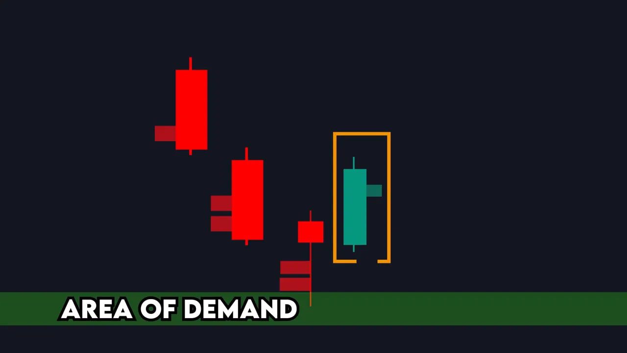
Imbalances: the lane markers of intent
The most actionable footprint feature for me is imbalances. These appear as small red or green rectangles next to a price cell when a price level has at least three times the volume compared to the opposing side diagonally.
Important rules:
- Compare diagonally, not horizontally. Buyers attack one tick above; sellers attack one tick below.
- A rectangle means one side drastically won that micro-battle. Use it as a clue for where price may react.
If buyer imbalances cluster above a candle, price should, in theory, close above them if buyer aggression holds. If price fails to close above, buyers are being absorbed and control can shift.
The Absorption Initiation Pattern (AIP)
To predict reversals with higher confidence combine two footprint behaviors:
- Absorption — a candle that closes against aggressive imbalances of the opposite side, showing one side is being soaked up.
- Initiation — the following candle that agrees with the imbalance by closing in the expected direction, showing directional intent.
Put together, absorption + initiation = AIP. This sequence signals that the aggressive side was absorbed and the other side has taken over intent. It is a powerful reversal marker when it occurs at a meaningful level.
Raise probability further with the Cumulative Volume Delta (CVD)
Delta shows who is winning per candle. The Cumulative Volume Delta (CVD) tracks delta over time and is perfect for spotting exhaustion via divergence.
Divergence patterns to watch:
- Price makes higher highs while CVD makes lower highs — buying is weakening, likely fade.
- Price makes lower lows while CVD makes higher lows — selling is weakening, likely bounce.
- Red candle with positive delta or green candle with negative delta — signs of absorption and potential reversal.
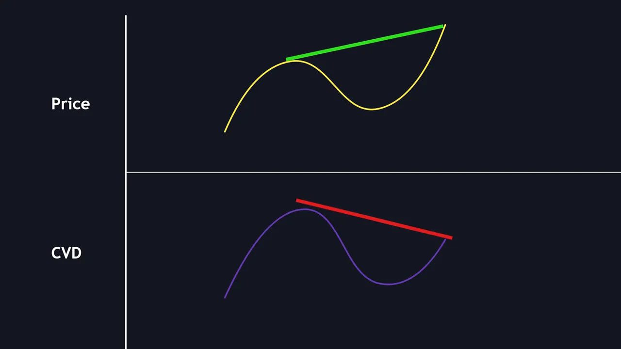
Use CVD to confirm whether the market is actually supporting the directional story your footprint shows. When absorption/initiation aligns with favorable CVD divergence, the edge increases.
Step-by-step trading framework (higher-timeframe, repeatable)
- Choose a higher timeframe — I prefer the 4-hour for cleaner levels, but this works on any timeframe.
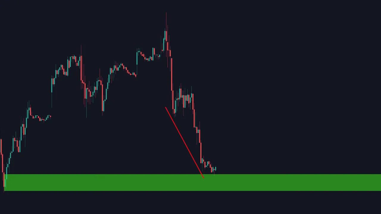
- Mark a key demand or supply zone — find the candle that began a strong move and draw the zone from that candle’s low to high (for demand) or high to low (for supply).
- Wait for a revisit — don’t enter when price simply touches the zone; read the room inside the zone first.
- Enable the volume footprint — look for absorption inside the zone and then an initiation candle that confirms intent.
- Check CVD — look for delta divergence that supports the absorption story.
- Enter after the initiation candle confirms. Place a stop loss below (for long) or above (for short) the demand/supply zone.
- Target logical highs/lows or prior structure; manage risk and trail stops as the trade runs.
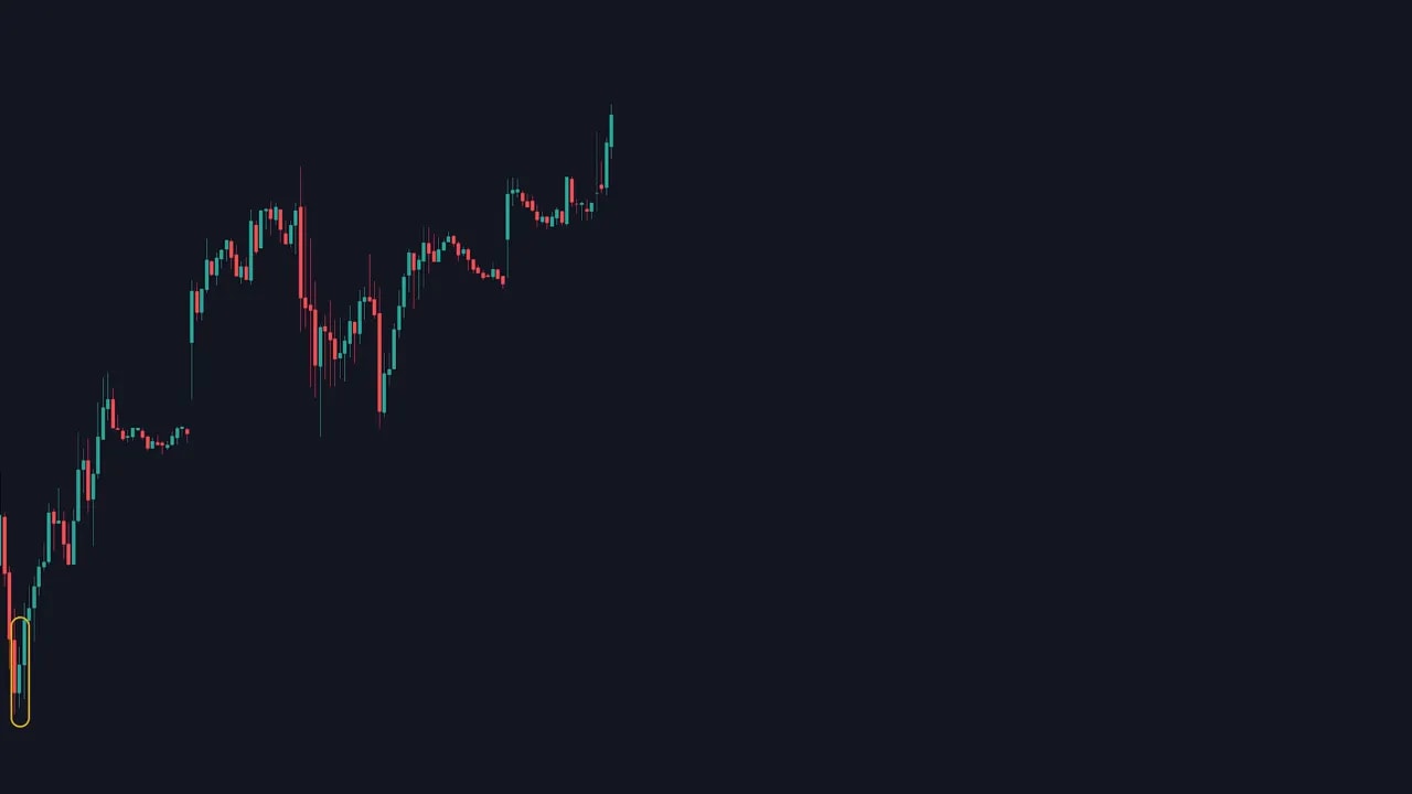
Real example (Tesla, 4-hour)
I marked a demand zone from the candle that began a strong upward move. When price revisited the zone I zoomed into the footprint and noticed seller imbalances inside the zone, but one candle closed above that imbalance — that was absorption. The next candle printed a buyer imbalance and closed above it — initiation. The CVD was making higher lows while price made lower lows, confirming delta divergence. Entry, stop under the demand zone, target the highs — trade worked as planned.
The mechanics are simple. The discipline is waiting for the AIP and the CVD confirmation before pulling the trigger.
Does this apply to crypto?
Absolutely. Order flow, footprints, imbalances and CVD are asset-agnostic primitives. Crypto markets have unique microstructure — different liquidity pools, varying tick sizes and 24/7 trading — which makes reading order flow especially valuable.
If you trade multiple blockchains or want live trade opportunities highlighted across crypto markets, consider tools that surface high-probability setups. Our crypto signals service flags setups that combine demand/supply zones, footprint-based absorption patterns and CVD divergence across coins and chains. It’s built to help you spot actionable opportunities without manually scanning dozens of pairs.
Common pitfalls and how to avoid them
- Relying on a single candle — use the AIP + CVD confirmation rather than one isolated signal.
- Ignoring context — higher-timeframe levels matter. Small footprint wins in isolation can fail at major structure.
- Poor risk management — always size and stop properly. Order flow improves entries; it does not replace stops.
- Overfitting on tiny imbalances — look for clusters and confirm with CVD and structure.
Quick reference: what to look for
- Absorption candle: closes against aggressive opposite-side imbalances.
- Initiation candle: closes in agreement with imbalances showing intent.
- Imbalance rectangle: one side has 3x the volume diagonally — high-probability clue.
- CVD divergence: confirms weakening of the aggressive side or strengthening of the other.
- Trade plan: entry on initiation, stop beyond zone, target structure highs/lows.
Final notes
Order flow is not magic, but it is a force-multiplier. It turns an outcome-only view into a map of market intent. Use footprint imbalances, the AIP sequence and CVD together and you will trade with much better evidence than by price alone.
Master the reading, practice on a few symbols, and keep risk first. The setups repeat — your job is to patiently wait for the ones that line up.
FAQ
What exactly is the volume footprint and how do I enable it?
The volume footprint shows executed sell and buy volume at each price level inside a candle (left = sells, right = buys). On TradingView you can enable it from the candle (chart type) menu and select Volume Footprint. It may look busy at first, but focus on the white/high-volume cells, imbalances, and VAH/VAL.
How do I identify a true imbalance?
Look for the small red or green rectangles on the footprint. They appear when one diagonal price level has at least three times the volume of the opposing side. Use diagonal comparison because buys attack one tick up and sells attack one tick down.
Which timeframe should I use?
The framework works on any timeframe, but higher timeframes like 4-hour produce cleaner zones and more reliable AIP patterns. Shorter timeframes can be used for faster execution but expect more noise.
Does this work for crypto markets?
Yes. Order flow and CVD are relevant in crypto. Because crypto liquidity varies, the footprint can be especially revealing. If you need help scanning multiple chains, a curated crypto signals service can highlight setups that match footprint and CVD criteria.
Where should I place stops and targets?
Place stops beyond the demand or supply zone that you used for the entry. Targets should align with recent structure — prior highs/lows or measured moves. Always size for the stop distance and follow a risk plan.
