

Indicators are one of the most misunderstood parts of trading.
Some traders worship them. Some traders hate them. And honestly, both sides usually have a point. A lot of indicators are not useless because they are mathematically wrong. They are useless because they are late. By the time they confirm what is happening, the market has already moved.
That is the real problem.
Most retail traders stack indicator on top of indicator, believing more confirmation equals better decisions. In reality, they are often layering multiple versions of the same delayed information. Different colors, different lines, same lag.
So here’s the only ranking that really matters: which indicators actually help in today’s market?
I’m ranking the major ones from S tier to F tier based on one thing only: whether they help you make better trading decisions. Not whether they look smart. Not whether they sound technical. Not whether they were popular in an old textbook.
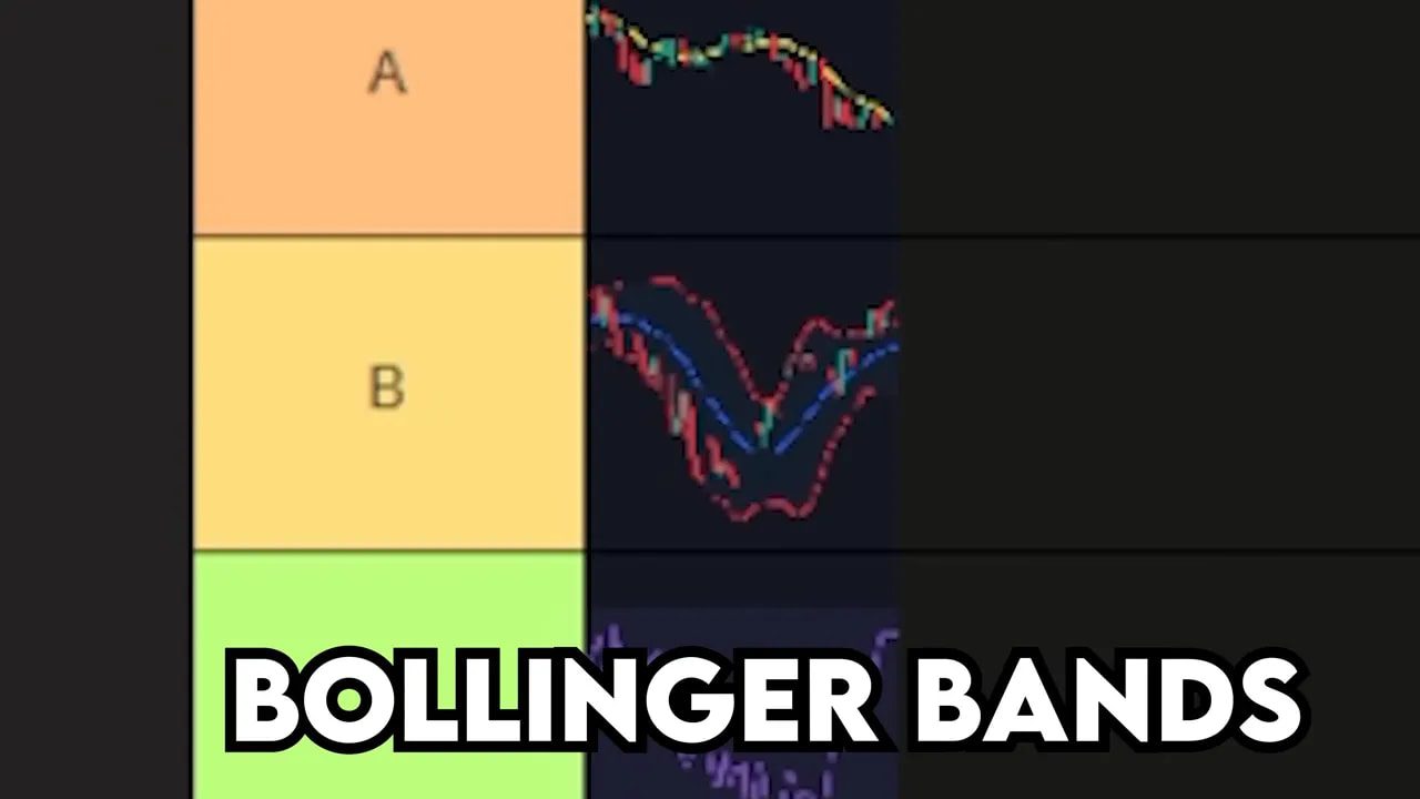
Table of Contents
- What Makes a Trading Indicator Worth Using?
- F Tier: MACD
- A Tier: Simple Moving Averages
- D Tier: Stochastics
- C Tier: RSI
- B Tier: Bollinger Bands
- A Tier: Donchian Channels
- B Tier: Fibonacci
- S Tier: Volume
- The Bigger Lesson: Stop Stacking Delayed Signals
- My Final Indicator Tier List
- FAQ
- Final Thought
What Makes a Trading Indicator Worth Using?
Before getting into the list, it helps to define the standard.
A useful trading indicator should do at least one of these things:
-
Show something the chart is not obvious about at first glance
-
Help identify trend, momentum, volatility, or participation
-
Improve timing without creating excessive noise
-
Still hold value in modern algorithm-driven markets
If an indicator is just repackaging old price data and handing it back to you with a delay, that is not edge. That is decoration.
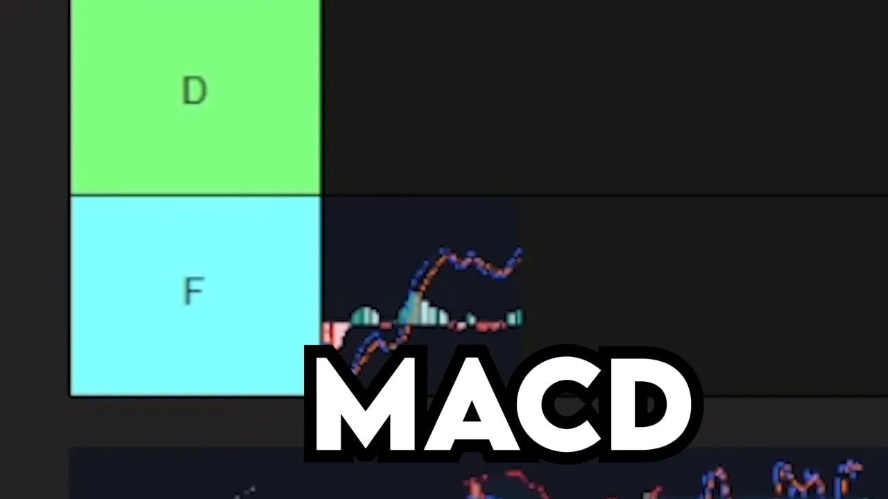
F Tier: MACD
Yeah, I said it.
MACD belongs in F tier.
The reason is simple: MACD is a lagging indicator built on top of another lagging indicator. You are not getting a fresh signal. You are getting a delayed signal of a delayed signal.
That is a disaster if timing matters, and in trading, timing always matters.
One of the clearest examples came during the 2022 bear market. MACD crossover signals were late by an average of 11 days. Think about that for a second. The market could be falling hard for nearly two weeks before the indicator finally tells you to get out.
A lot can happen in 11 days:
-
A swing trade can fully unwind
-
Drawdown can accelerate
-
Panic selling can already be near exhaustion
-
The best exit may already be gone
That does not make MACD evil. It just makes it too slow to deserve the reputation it gets.
A Tier: Simple Moving Averages
Simple moving averages, especially higher time frame moving averages, absolutely deserve respect.
I’m talking specifically about levels like:
-
50-day moving average
-
200-day moving average
-
50-week moving average
-
200-week moving average
These work for a very different reason than most traders think.
It is not because the formula is sophisticated. It is actually the opposite. They work because they reflect real averages of market behavior, and averages matter.
Even more important, the biggest players in the market watch these levels. Pension funds, CTAs, hedge funds, institutional desks, they all pay attention to these moving averages in some form. When price interacts with the 200-day moving average, that level gets collective attention. Collective attention creates real buying and selling pressure.
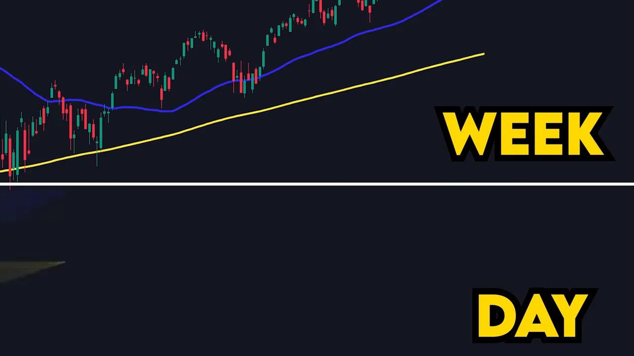
That is what makes them powerful. Not mystery. Not magic. Participation.
There is also a discipline advantage here. A lot of traders know the 200-day moving average matters, but very few have the patience to wait for price to actually come into it. The edge is often not hidden in complexity. It is hidden in doing the boring thing consistently.
If you trade stocks, indexes, or even crypto on higher time frames, these moving averages are worth keeping on your chart every week. And if you are active in digital assets, this is also where disciplined market analysis matters most. In fast-moving environments, many traders pair higher time frame levels with crypto spot trading signals to stay focused on clean setups instead of chasing random moves across different coins.
D Tier: Stochastics
Stochastics land in D tier.
The best way to describe it is this: it is basically MACD with more noise.
In a strong trend, stochastics can pin to the top or bottom and stay there. That leaves you with a signal that tells you almost nothing useful. In a choppy market, it can flip back and forth so often that it practically boomerangs you in and out of trades.
That constant whipsaw is how accounts get slowly drained.
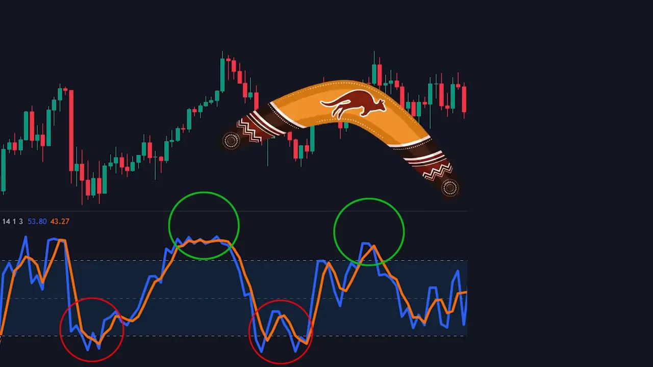
There is also a bigger structural issue. Stochastics worked much better in an older market environment. Back in the 1980s, markets were slower, more human, and far less dominated by machines. Today, roughly 70% of trading is algorithmic. Patterns that were once exploitable can now be arbitraged away in milliseconds.
That does not mean no one can use stochastics effectively. It means the classic interpretation has lost a lot of practical value in modern markets.
C Tier: RSI
RSI gets a C tier.
I do not hate RSI. It does have some value. But most traders are taught to use it in the worst possible way.
The standard beginner approach goes like this:
-
Buy when RSI is oversold
-
Sell when RSI is overbought
Sounds logical. Usually performs terribly.
Why? Because RSI measures momentum. That is it. If RSI is overbought, that does not automatically mean price is about to fall. It often just means price has been moving strongly upward. And strong moves can stay strong much longer than people expect.
A perfect example was crude oil in 2022. It stayed overbought on RSI for 34 consecutive days while price kept climbing. If you kept shorting just because the indicator screamed “overbought,” you would have been run over for more than a month.
So where does RSI actually help?
Divergence.
This is where RSI becomes interesting. If price is making higher highs while RSI is making lower highs, that is a sign momentum is fading underneath the surface. Price may still be rising, but the engine is weakening. That can be a legitimate warning sign before a reversal or hard pullback.
So RSI is not trash. It is just usually misused.
Use it for divergence, not for blind overbought and oversold signals.
B Tier: Bollinger Bands
Bollinger Bands belong in B tier.
This is a very good indicator, but only if you understand what it actually measures.
Bollinger Bands do not tell you direction. They tell you volatility.
That distinction matters.
Think of Bollinger Bands like a smoke alarm. If the alarm goes off, it tells you something is happening. It does not tell you where the fire is or which direction you should run. It simply tells you to pay attention.
That is exactly how Bollinger Bands should be used. They highlight compression, expansion, and volatility extremes. They tell you when the market is getting active enough to matter. But they still need to be paired with another framework, whether that is structure, trend, volume, or support and resistance.
Used alone, they can mislead. Used as an alert system, they are excellent.
A Tier: Donchian Channels
Donchian Channels are A tier.
Simple. Clean. Effective.
The concept is straightforward: Donchian Channels mark the highest high and lowest low over the last 20 trading sessions. That means when price breaks out of the channel, the market is doing something it has not done for a full month.
That is worth your attention.
A breakout from a Donchian Channel often signals that something meaningful is happening:
-
Important news
-
A volatility expansion
-
A momentum shift
-
A genuine trend continuation
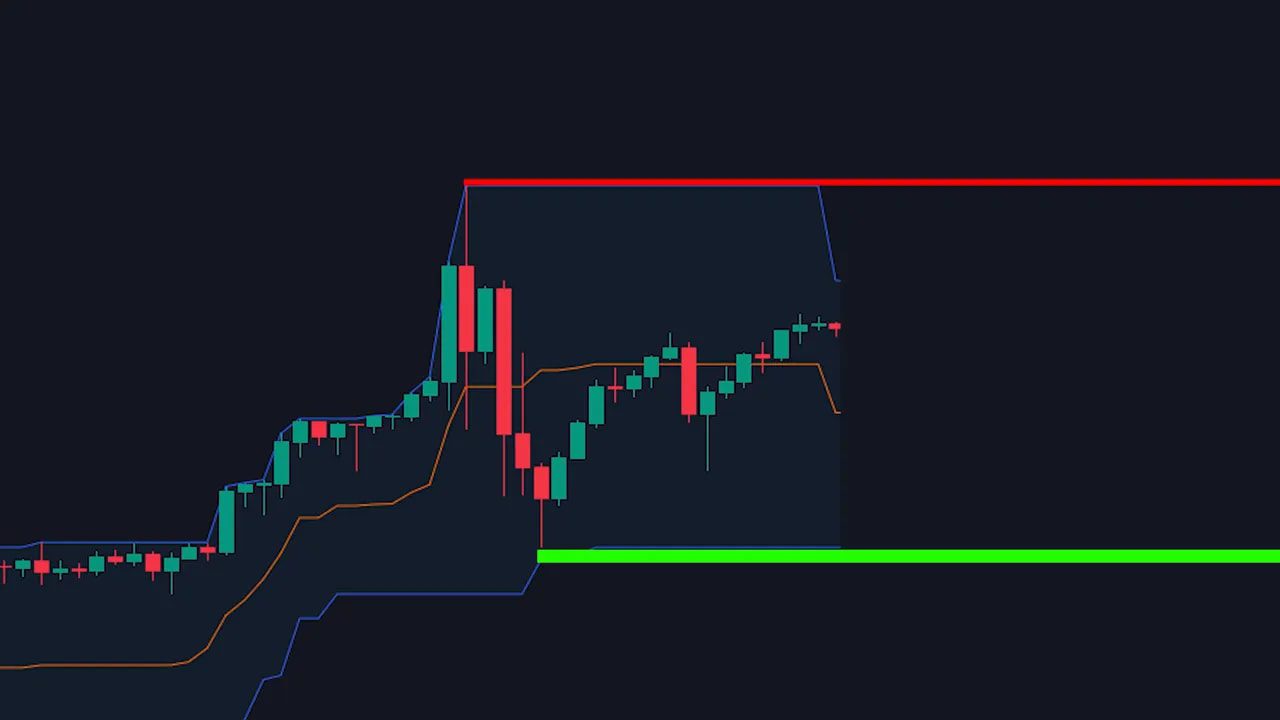
This is part of what makes Donchian Channels so useful. They are not overcomplicated. They do not drown the chart in interpretation. They simply identify when price is breaking outside a recent range in a way that matters.
That simplicity is a feature, not a weakness.
B Tier: Fibonacci
Fibonacci lands in B tier.
And yes, this one makes a lot of traders uncomfortable because the justification is weird.
There is no rigorous economic reason why Fibonacci retracement levels should hold. They are not directly tied to cash flows, earnings, or some deep market fundamental.
And yet, they often work.
Why? The best explanation is pattern recognition and crowd behavior. Fibonacci ratios show up all over nature and mathematics, and a lot of traders believe those same recurring patterns bleed into how humans react to price movement.
You can debate the theory all day. What matters is that traders repeatedly respond to these levels.
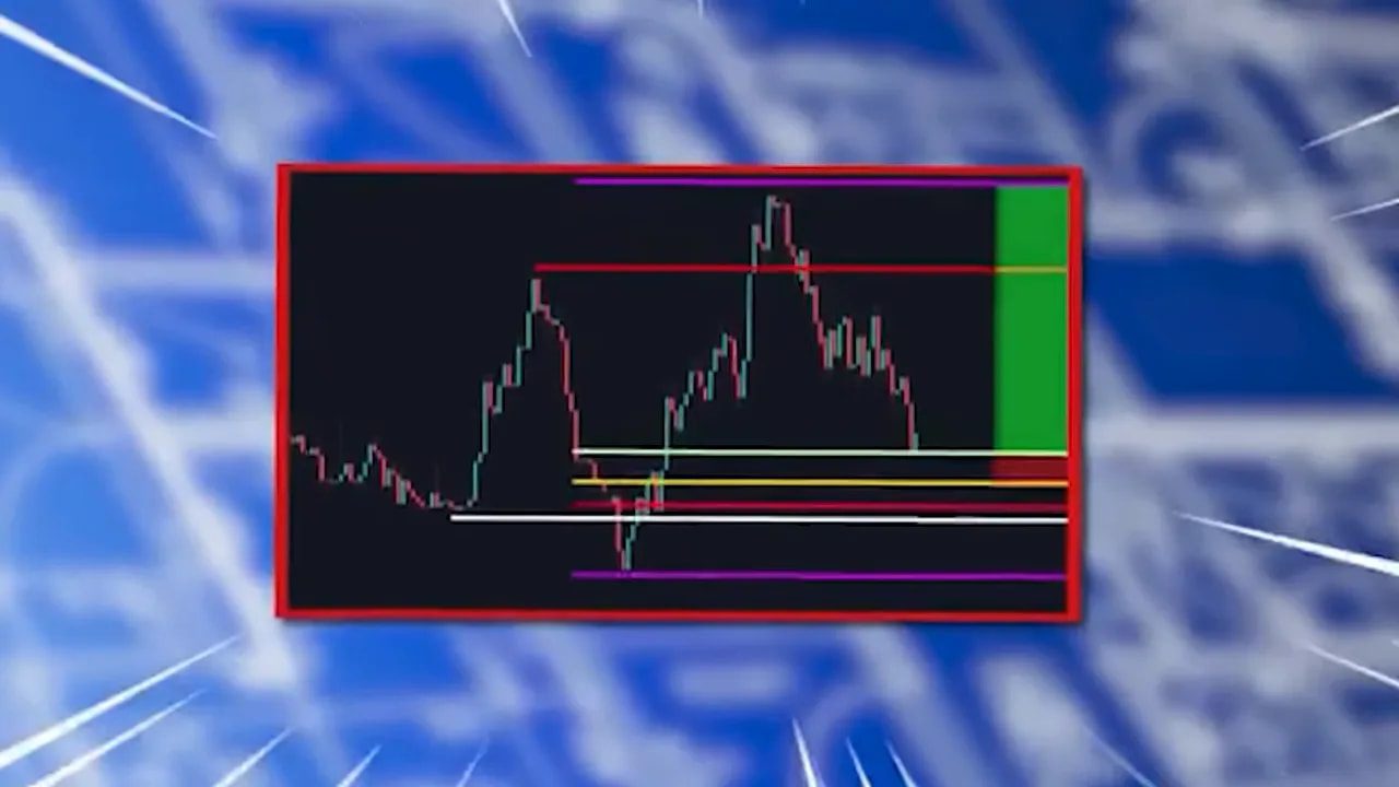
The most useful way to apply Fibonacci here is by focusing on the golden zone.
The process is simple:
-
Find a clear trend
-
Draw the Fibonacci tool from the low of the move to the high of the move
-
Mark the key retracement area known as the golden zone
-
Watch for price to retrace into that zone and reverse
That reversal happens often enough to be worth serious respect. It is one of those tools that sounds mystical until you actually go through chart after chart and see how often price reacts there.
For crypto traders, this becomes especially useful during trend pullbacks on high-volatility assets. On fast blockchains and rotation-heavy markets, retracement zones can help narrow down cleaner entries. Some traders combine those levels with crypto spot trading signals to filter which pullbacks are worth acting on and which ones are just noise inside a weak setup.
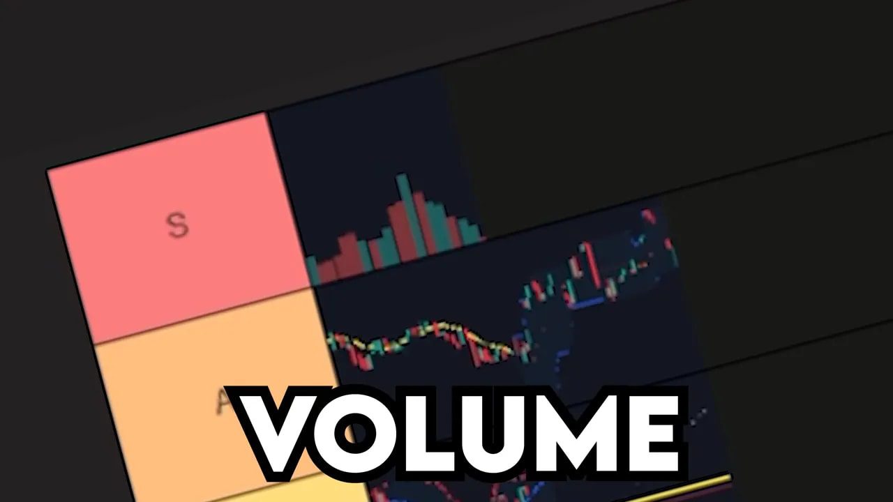
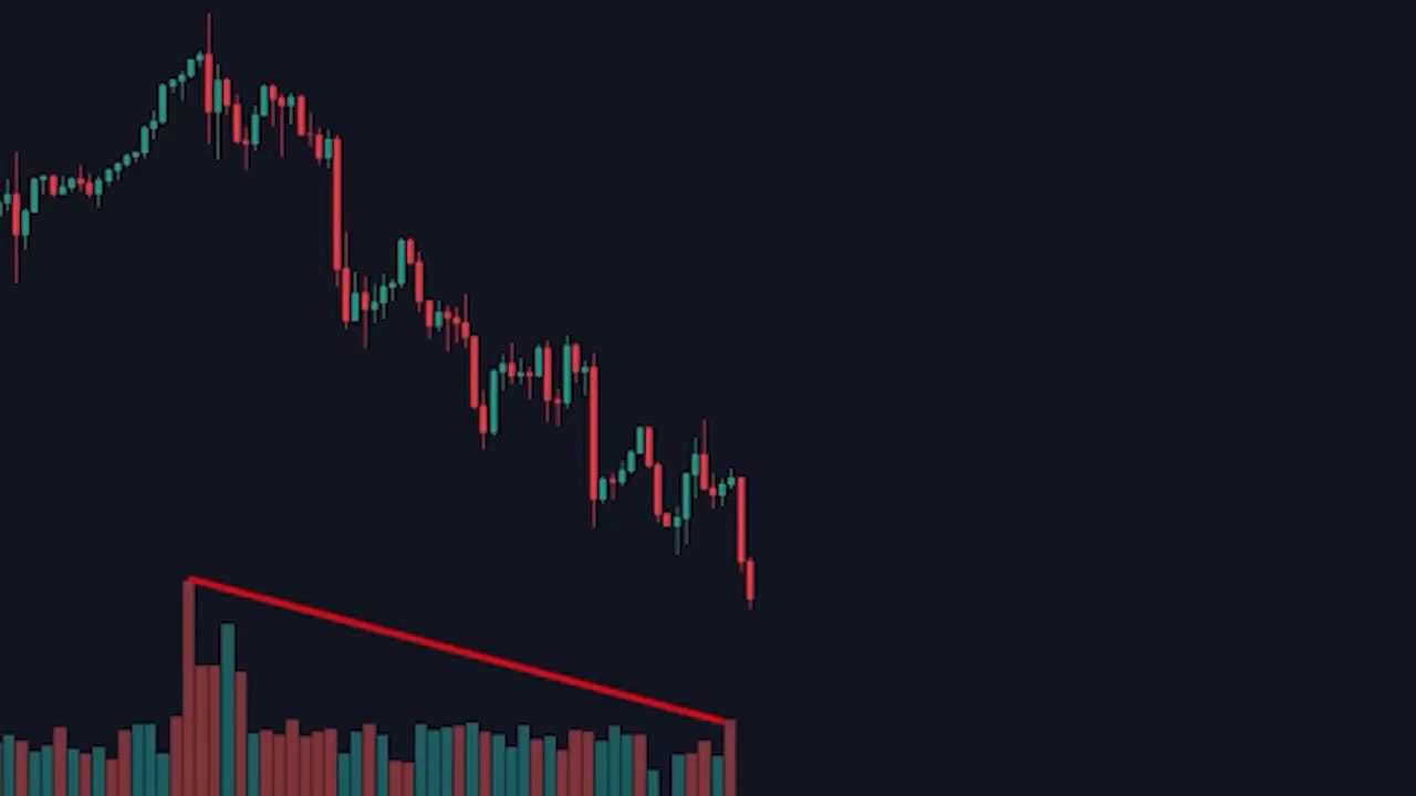
S Tier: Volume
The only S-tier indicator on the list is volume.
And honestly, it is not close.
Here is why volume stands above everything else: every other indicator on this list is derived from price. MACD, RSI, and stochastics all reprocess the same source data. They are downstream from price action.
Volume measures something different.
It measures participation. It measures conviction. It tells you whether a move is actually being supported by real activity.
Why Volume Matters More Than Most Traders Realize
Imagine a chart that is pushing higher, printing higher highs and higher lows. If you only look at price action, that appears to be a strong uptrend.
But then you check volume and notice something important: each new push upward is happening on less and less volume. Transactions are decreasing. Participation is fading. The move is still climbing, but the conviction behind it is weakening.
That changes the whole interpretation.
Instead of seeing strength, you start seeing fragility. That kind of divergence between price and volume often shows a move is running out of fuel. A drop becomes much more likely.
The same logic works in reverse.
If price is falling in a strong downtrend, making lower highs and lower lows, but volume is also weakening with each leg down, that can signal seller exhaustion. The declines are happening with less participation. Selling pressure is drying up. A bottom may be forming.
This is why volume belongs in its own category. It is not simply interpreting what price already did. It helps reveal whether the move has real support underneath it.
What Volume Tells You That Price Alone Can Miss
-
Breakout quality: Is the breakout being backed by strong participation?
-
Trend strength: Is the trend gaining support or fading?
-
Exhaustion: Are buyers or sellers running out of steam?
-
Potential reversals: Is price diverging from conviction?
In crypto especially, where narratives can send assets flying and then collapsing in a matter of hours, volume becomes even more important. If you are scanning opportunities across different ecosystems and trying to separate real accumulation from low-quality pumps, volume is one of the few tools that can keep you grounded. That is also why many traders look for crypto spot trading signals that incorporate volume confirmation instead of relying on price movement alone.
The Bigger Lesson: Stop Stacking Delayed Signals
The ranking itself is useful, but the bigger takeaway matters more.
Most retail traders are stacking indicators that all come from the same data source.
They combine MACD with RSI, add stochastics, maybe throw in a few moving averages, and end up with a chart that looks sophisticated but says very little. What they are really doing is creating several slightly different versions of the same delayed answer.
That is not clarity. That is noise.
A cleaner approach is to use a small set of indicators that each serve a different function. For example:
-
Moving averages for broad trend and institutional levels
-
Donchian Channels for meaningful breakouts
-
Bollinger Bands for volatility awareness
-
RSI divergence for momentum warnings
-
Volume for confirmation and conviction
That kind of combination makes sense because each tool is doing a different job.
My Final Indicator Tier List
-
S Tier: Volume
-
A Tier: Simple Moving Averages, Donchian Channels
-
B Tier: Bollinger Bands, Fibonacci
-
C Tier: RSI
-
D Tier: Stochastics
-
F Tier: MACD
If that list feels aggressive, good. A lot of traders need to be far more ruthless about what stays on their chart.
FAQ
What is the best trading indicator overall?
Volume is the strongest overall indicator here because it measures something price-based indicators do not: real participation and conviction. It helps identify whether a move is actually supported or quietly weakening underneath the surface.
Why is MACD ranked so low?
MACD is ranked in F tier because it is highly lagging. It is built from moving averages, which already lag price, so the signals often come too late to be useful. In fast markets, delayed confirmation can be expensive.
Are moving averages still useful in modern markets?
Yes, especially higher time frame moving averages like the 50-day and 200-day. These levels matter because major institutions pay attention to them, and that shared focus can create real buying or selling pressure.
How should RSI actually be used?
RSI is most useful for divergence, not for blindly buying oversold conditions or selling overbought conditions. If price is making new highs but RSI is making lower highs, that can signal momentum is weakening and a reversal may be near.
What do Bollinger Bands tell you?
Bollinger Bands mainly measure volatility, not direction. They tell you when a market is becoming active enough to pay attention to, but they should be paired with another method for deciding trend or trade direction.
Why do Donchian Channels work so well?
Donchian Channels highlight when price breaks above the highest high or below the lowest low of the last 20 sessions. That means the market is doing something new on a one-month basis, which often signals a meaningful breakout rather than random movement.
Do Fibonacci levels really work?
They often do, even if the economic justification is weak. Fibonacci retracement levels appear to matter because enough traders react to them, especially around the golden zone where pullbacks often reverse during a trend.
Should traders use multiple indicators at once?
Yes, but only if each indicator serves a different purpose. The mistake is stacking multiple indicators that all repackage the same price data. A better approach is to combine tools for trend, volatility, momentum, and volume without creating redundant noise.
How can crypto traders apply these indicators more effectively?
Crypto traders can use moving averages for higher time frame trend, Fibonacci for pullback zones, and volume for breakout confirmation. In fast-moving markets, many also rely on crypto spot trading signals to help narrow down which setups have real momentum and which ones are just short-lived hype.
Final Thought
The goal is not to collect indicators. The goal is to understand markets better.
If an indicator helps you see trend, momentum, volatility, or conviction more clearly, keep it. If it just adds clutter and confirms what already happened after the move is mostly over, cut it.
Simple almost always beats complicated.
And when in doubt, trust the one thing that cannot fake conviction for long: volume.
